
“Originally written and published collectively in 1976 by the separatist lesbian commune WomanShare, who lived and worked together in Southern Oregon. Containing poems, diaries, manuals, interviews, and hexagonal architecture. I like its directness and the imperfections of the text, illustrations, and pictures. The book published in 2024 is a facsimile, which translates the nature of the original. Following the history of the common effort, it will help finance the publishing of the new collectively translated edition.“
Ivana Čobejová is an architect and critical illustrator working across visual culture and social commentary.
Written by Sue Deevy, Nelly Kaufer, Dian Wagner, Carol Newhouse and Billie Miracle
Published by Ness Books
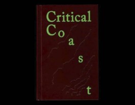
“Critical Coast is a quiet, generous book about imagination and place. I chose it for three reasons. First, its multidisciplinary approach moves between science, literature, and art, forming a hybrid of essay, atlas, and manifesto. Second, the form: a beautiful object that reflects this multidisciplinary approach and gently guides the reader through a complex theme. Third, its thinking travels easily across disciplines—replace “coast” with any landscape, city, or even yourself, and the ideas still resonate.“
Martin Jenča is cofounder of Büro Milk and Brot Books Deli bookshop.
Created by Anna Aslaug Lund and Jeppe Sengupta Carstensen.
Published by Arkitektens Forlag
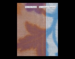
“Piecing Pages by Line Arngaard brings together research projects by a selection of designers and artists around the subject of working in fragments. Taking traditional women’s craft techniques as a starting point, the book dives into working processes of various female makers. I find both the larger editorial choices as well as the individual contributions really fascinating and think the book can offer a lot of insights for young designers that are in search of their own voice.“
Laura Pappa is a graphic designer and educator working between Amsterdam and Tallinn.
Written and self-published by Line Arngaard
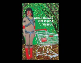
“This small book was gifted to me by a young designer who came up to me after a lecture in Málaga. It was ‘Life is not useful’ by Ailton Krenak. In this small volume the indigenous writer and philosopher from the Krenak people manages to explain capitalism, climate change and current state of crisis more clearly and more urgently than any academic volume could achieve. Words that go straight to the heart.“
Ruben Pater is a designer who, in search of ethical alternatives, works across design, writing, and education.
Written by Ailton Krenak
Published by Polity Press
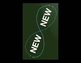
“What intrigues me most about typography is the sense of playfulness that can be found within the field, which is why I chose this book. It brings together fragments from different eras, weaving them into a dynamic interplay of glyphs. The question of what is truly new reveals itself as a journey through time. Flipping through playful design approches takes the pressure off during my own design process. That is what I appreciate most about the book. I can take a short break, leaf through its pages, and then return to my work with smiling eyes.“
Hannah Sakai is a graphic designer shaped by different cultures and languages, with a focus on typography, design, and spatial experience.
Edited by Matter Of (MO-P-255)
Published by Sorry Press
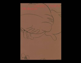
“This small book was gifted to me by a young designer who came up to me after a lecture in Málaga. It was ‘Life is not useful’ by Ailton Krenak. In this small volume the indigenous writer and philosopher from the Krenak people manages to explain capitalism, climate change and current state of crisis more clearly and more urgently than any academic volume could achieve. Words that go straight to the heart.“
Malou Messien is a graphic designer and educator based in Paris.
Written by Ola Vasiljeva
Published by Roma Publications
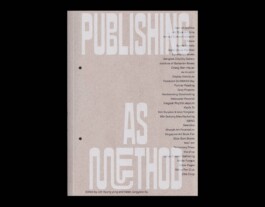
“The book resonated with me because it approaches publishing not only as a means of distributing content but as a critical design practice and a way of thinking. The editorial structure, production, and graphic design clearly reflect this perspective, showing how publishing can organise knowledge and shape the ways it is read and shared. In particular, the book frames publishing as a method for research, collaboration, and discourse, which strongly resonates with my own practice.“
Sam Kim is the founder of Common Imprint, a Berlin-based bookshop focused on Asian publishing.
Conceived by Lim Kyung yong and Helen Jungyeon Ku
Published by mediabus
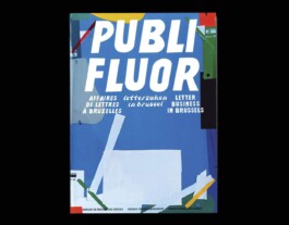
“It documents a remarkable episode of vernacular lettering in Brussels. In 1996 designer Pierre Huyghebaert noticed distinctive shop window lettering in the city’s northern districts. For nearly fifty years the Crickx family produced fluorescent adhesive letters of their own design and sold them to local shop owners. Created outside any formal typographic tradition, these shapes formed a unique visual language that shaped the appearance of many storefronts in the city. After the shop closed in 2000, designers of OSP archived and digitized the letterforms, later developing typefaces from them. The project culminated in the 2024 publication, documenting the history of this exotic lettering practice.“
Yevgeniy Anfalov is a Ukrainian graphic designer focusing on typography and creator of the Kyiv Metro Fonts project.
Conceived by Crickx research group
Published by Surfaces Utiles
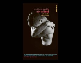
“The book is about a young man who suffers from panic attacks. In fact, it's also my story, because it reminds me of myself when I had my first panic attack in a train at the same age. Essentially, while reading it, I'm speaking to the person I was back then.“
Marco Fiedler is a graphic designer and co-founder of Vier5, a Paris-based studio focused on developing distinctive visual languages and contemporary typography rooted in a critical approach to design.
Written by Alexander Kielland Krag
Published by Blauw Gras
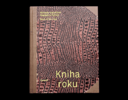
“This book is deceptive—not only in its oddly appropriated cover and substantial size, but also in its title. A note on the endpaper hints at its concept: two illustrator friends exchanging one drawing a day, with comments, for an entire year. By opening it anywhere, the idea becomes instantly clear. What follows is an honest, effortless visual record of everyday life in all its facets. In an age of instant sensations and endless scrolling, the book reveals what we often overlook. Like Seinfeld, it could be said to be “about nothing”—yet its strength lies in how the authors perceive and playfully reinterpret lived moments. Presented as daily diptychs, the drawings can stand alone or together. Rather than capturing “small histories,” the book reflects a broader, deeply human experience.”
Palo Bálik is a book designer and head of Laboratory of Typography at the Visual Communication Department of Academy of Fine Arts and Design in Bratislava. He is the author and co-author of scientific publications, founder of the Slovak typographic knowledge base typografia.xyz and the academic publishing house nakladatelstvo.xyz.
Written by Michaela Kukovičová and Magdalena Rutová
Published by Baobab
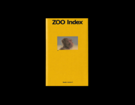
“Sometimes a book matters because it takes you somewhere. Zoo Index, a beautifully designed and independently published book by Terezie Štindlová, quite literally took me on a book launch journey across Europe — including what might have been my last visit to a zoo.
The publication explores our relationship to animals, the politics of captivity, and the role of zoo architecture, among other themes. It’s a book that gently but persistently shifts your perspective — and might make you think twice about visiting a zoo again.“
Bára Růžičková is a Czech graphic designer and illustrator whose work combines playful typography with a critical perspective on contemporary visual culture. She studied at the Faculty of Fine Arts in Brno and gained international experience through internships in Vienna and Porto. Her projects focus on social relevance and long-term impact rather than disposable design.
Self-published by Terezie Štindlová

“‘I have selected 31 books as Muses’. This is the simple and essential premise of John Morgan’s Baskerville’s Teardrop Explodes, written shortly before he died in September 2025. John felt no anxiety about acknowledging the influence of other books on his own work, and writes with a certain pride of how over time, the books we live with ‘seep into our blood, into our bones, into the lenses of our eyes’. And as much as the book presents a cast of particularly cherished titles, Baskerville’s Teardrop Explodes exposes not just John’s own working methodology but an arresting portrait of the man himself. ”
Adrien Vasquez (FR/GB) is a graphic and type designer. He worked with John Morgan since 2011. In 2017, they founded Abyme, a digital type foundry and independent publisher of artist’s editions and multiples. Following John Morgan’s death in 2025, he co-founded Lima Vasquez studio with Teresa Lima. He teaches at ÉSAD Valence.
Written by John Morgan
Published by Ten Thousand Angels Press
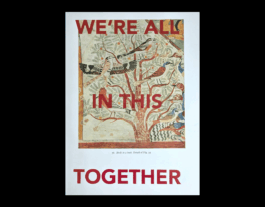
“We came across this work at SPRINT in Milan, where Rahel Zoller and Louis Porter first presented it. Using an edition of The History of Art by E. H. Gombrich, they printed WE ARE ALL IN THIS TOGETHER across every odd-numbered page, each sold at a price corresponding to its page number. We were lucky to get page 15.
The project reflects ongoing questions around the economics and distribution of publishing, and highlights how much it ultimately depends on community and collective effort.“
Astrid Seme is a Vienna-based graphic designer working across typography, editorial design, and visual identity. A graduate of Werkplaats Typografie and the University of Applied Arts Vienna, she also explores typography through sound. Her book Baroness Elsa’s em dashes reflects a research-driven approach to design. She co-runs Mark Pezinger Books with Thomas Geiger.
WE’RE ALL IN THIS TOGETHER is a project by Zoller & Porter.
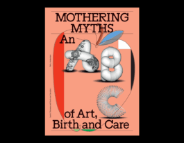
“I selected the book ‘Mothering Myths – An ABC of Art, Birth and Care’ edited by Laurie Cluitmans & Heske ten Cate. The book reads as a rich compendium on motherhood, parenting in the arts – spanning history and cultures. Beside it being a fantastic read, it is a beautifully designed object by my dear friend Bart de Baets.”
Sandra Kassenaar is a graphic designer and art director based in Amsterdam. Her editorial-focused practice spans print and exhibition design, often in collaboration with creatives across disciplines. Since 2015, she has co-produced the biannual magazine MacGuffin and also teaches graphic design at ArtEZ in Arnhem.
Edited by Laurie Cluitmans & Heske ten Cate
Published by Valiz
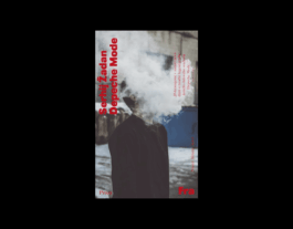
“Žadan describes reality, the gaps in its fabric, and the holes through which you fall into places where things are the same—only different. Even Depeche Mode carries echoes of the nineties, just in another form. The inserted manual Explosive Vaseline promises to help “better understand the principles and tendencies of socio-productive relations in contemporary society.”
No matter how much it tries or pretends, graphic design cannot answer questions or save the world. Good prose just might.”
Jan Čumlivski is a multidisciplinary artist, writer, and designer educated in Prague, with additional studies and internships across Europe. His practice spans drawing, typography, engraving, and bookmaking, resulting in distinctive authorial publications. Alongside his artistic work, he teaches graphic design, co-organizes the Tabook festival, and works as an editor.
Written by Serhij Žadan
Published by Fra
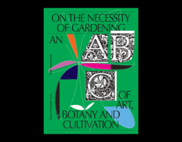
“‘On the Necessity of Gardening’ does not offer a linear reading experience. It is a book I have owned for a long time and always enjoy returning to. It revives the idea of an encyclopedia for adult readers, where text and image naturally intertwine. You can open it anywhere—read individual entries, essays, or simply browse a few pages. It offers insight into the story of the garden as a metaphor for society, with Bart de Baets’ design creating a unique structure that connects form and content.”
Adéla Svobodová is a graphic designer and co-founder of the studio Pauline&Adela, established in 2007 with Pauline Kerleroux. Her practice focuses on the cultural field, particularly book and catalogue design, often in collaboration with contemporary artists. She has received numerous awards, including a gold medal in 2011 for Atlas of Transformation in international book design competitions.
Edited by Laurie Cluitmans
Published by Valiz
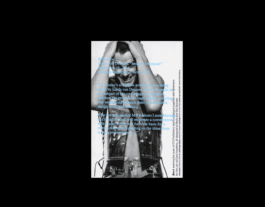
“The book Image Continuum by Linda van Deursen was published last year by one of the most interesting contemporary graphic design schools — EKA Graphic Design. The publication is part of the Slideshow series, which connects lectures with the book format. This small book emerged from Linda van Deursen’s lecture about her long-term interest in the ’image’ within both her creative and pedagogical practice. It explores themes of archives, editing, sequencing images, as well as a broader perspective on the role of the graphic designer.”
Ľubica Segečová is a graphic designer and curator of Mapping What Matters 2026. She is a co-founder of the studio trivjednom and the festival Self, has long been engaged in exploring the overlaps between design and social and educational contexts.
By Linda van Deursen, Alexandra Margetic ed., Sean Yendrys ed.
Published by Applied Work
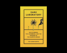
“Dark Laboratory is a book and a research collective. This book brings me hope every time I read it or teach architecture students on climate crises relation to labour politics and land grab. Tao Leigh Goffe invites us to think catastrophe anew, across long centuries and beyond Eurocentric definitions. ‘With the cycle of hurricane season, Caribbean people cannot afford to live in this despair.’ Chapter 9, Affective Plate Tectonics.”
Maria Topolčanská is architect, founder of Fake Cities True Stories, teaching and working on institutional change in public education towards urban justice.
Written by Tao Leigh Goffe
Published by Hamish Hamilton
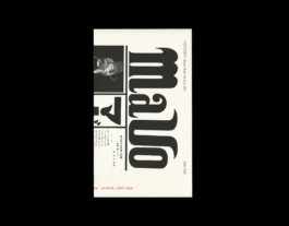
“One hundred years after El Lissitzky wrote his publishing manifesto “The Future of the Book”, we wanted to revisit how publishing has changed since 1926 and ask where it might go next. The MWM conference in Bratislava prompted us to publish a Slovak translation of the text. Lissitzky envisioned a book in which imagery is primary and text secondary: a "non-national" book, comprehensible across languages, stripped of automatism, in which form multiplies the impact of content. He was writing at the threshold of what he called the age of dematerialisation, and reading him now, it is hard not to feel that he anticipated something the internet and social media have since rushed in to fill, for better and worse. We ask ourselves what would a publishing manifesto written in 2026 look like.”
UTOPIA LIBRI is a publishing cooperative focusing on politics, visual arts, philosophy, queer feminism, sociology, fiction, ecology, and generally transdisciplinary and anarchist perspectives
Written by El Lissitzky, 1926
Published by UTOPIA LIBRI, 2026
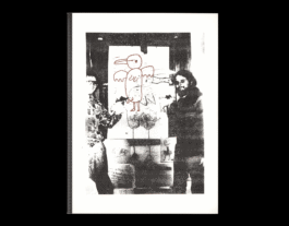
“I chose The Tinklers Charts and Stories for its raw, playful approach to publishing and storytelling. The work embraces a DIY spirit through charts, songs, and drawings. It feels loose and uncontained, like it could have been made at a copy shop on a random stack of colored sheets, assembled as it went. It holds onto that rough, slightly chaotic energy where making feels playful, intuitive, and unpredictable.”
Bardhi Haliti is a Kosovar graphic designer and researcher working between Prishtina and Amsterdam, known for his precise, typography-driven work for arts and cultural clients. In his lecture, he presents a long-term research project mapping sports halls in Kosovo, showing how their changing names and architecture reflect the country’s political and social transformations. He is also the co-founder and program director of REDO, an international graphic design event in Prishtina.
Published by Rollo Press.

“Nat Pyper's A Queer Year of Love Letters reminds us what letters are for: to weave threads between past, present, and future generations, to convey the meaningful stories of those who came before us, full of love. Nat Pyper’s work is not merely archival and academic, it is “a toolkit for writing and remembering queer and trans histories”. Here, typography is embodied and alive.”
Alex Balgiu is an educator and designer-writer working at the intersection of language and graphic design. Attentive to the rhythms and silences of language, his practice challenges reading conventions and narrativity in contemporary publishing.
Co-published by Inventory Press & Library Stack
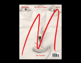
“MacGuffin magazine is a publication I’ve been following since I was becoming a graphic designer myself. Each issue revolves around a single object, unfolding it through layered stories, perspectives, and contexts. What keeps me coming back is its strong editorial concept—clear, consistent, and yet open enough to evolve with every issue. Over the years, I’ve never grown bored of it. As I’ve gotten older and developed as a designer, the magazine has somehow kept pace. It has been a quiet constant alongside my own growth, and that kind of long-term relationship feels quite special.”
Terézia Denková is a Slovak graphic designer. She is the co-founder of Mapping What Matters, founder of Typogaráž and co-founder of TaB Studio. Her work focuses on editorial and book design as well as visual identities, with projects for cultural and independent institutions.
Edited by Kirsten Algera, Ernst van der Hoeven
Published by MacGuffin Publishing
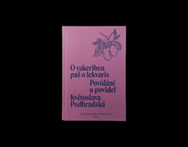
“Sometimes a book can strike you and open up a new perspective on a reality. That is exactly the effect the publishing house Kher had on me, along with their book — O vakeriben paš o lekvaris / Povídání u povidel. This bilingual publication presents Roma stories in both Romani and Czech, contributing to the development of literature in the Romani language. At a time when minority perspectives continue to be underrepresented, it is essential to not only preserve their voice — spoken or written — but to actively nurture it.”
Barbara Kowalczuková is co-founder of Mapping What Matters and a graphic designer at TaB Studio, which she co-founded with Terézia Denková. Her practice focuses on visual identities and publication design, with an emphasis on concept and visual clarity. Her work often involves projects with a cultural, critical, or socially oriented focus.
Written by Květoslava Podhradská
Published by Kher
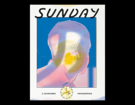
“Sunday by Olivier Schrauwen, one day in the life of a mildly annoying, obsessively thinking type designer, Thibault, set in Ghent. Once again, a variation on Ulysses. It is quite an object, 475 pages thick, yet one can read it without a table. It is definitely funny, and rightly annoying at moments.
Why do I recommend it? I just read it in bed with someone, and reading comics together was new for me, which is already a good reason. Also, I never thought I would spend so much time in Belgium myself, and in Sunday there is something inherently Belgian, Flemish to be concrete. In the book, it is a Sunday in 2017, and the book was published as a whole in 2024. Somehow, the fact that it is 2017 is very apparent to me. Now we live in a different world.”
Martin Groch is a Slovak graphic designer, typographer, educator, and writer based in Antwerp. His work moves between editorial design, research, and publishing, often exploring language, typography, and the cultural context of graphic design. He teaches at the Royal Academy of Fine Arts in Antwerp and regularly contributes essays and criticism on design.
Created by Olivier Schrauwen
Published by Fantagraphics.
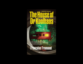

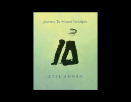
“The House of Dr Koolhaas by Françoise Fromonot (2025) — because of the ways and perspectives it re-investigates its subject (a famous villa) — something I find very relevant to the practice of a graphic designer.
Sweathearts by Martin Groch (2024) — because of the love, drama, getting lost and the fact its characters also exist in the form of a typeface.
Journey to Mount Tamalpais by Etel Adnan (2021/1986) — because I look at this mountain every day from where I live — but it could be anyplace — and makes me appreciate and respect the immediate beauty of my surroundings, of Earth.”
Adam Macháček is a graphic designer working internationally. He studied at Prague’s UMPRUM, with internships at the Gerrit Rietveld Academie in Amsterdam and ÉCAL in Switzerland.
The House of Doctor Koolhaas
Written by Françoise Fromonot
Published by Park Books
Sweathearts
Created by Martin Groch
Published by Abyme
Journey to Mount Tamalpais
Written by Etel Adnan
Published by Asterism
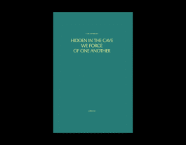
“CAConrad’s work has so much magic in it that it’s hard to explain and much easier just to experience. Every word and every poem makes you stop and feel something. This book with their poetry and other texts somehow struck me hard. And apart from the content, the overall design is also so amazing, simple yet special and strange: very inspirational to me and my practice.”
Terezie Štindlová is a graphic designer and researcher based in Amsterdam. She is part of Day Shift Office and the founder of ZOO Index, an ongoing research platform exploring the cultural and social dimensions of zoological gardens.
Written by CAConrad
Co-published with Batalha Centro de Cinema
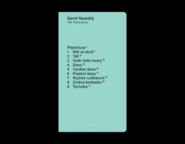
“I selected UMPRUM’s KATEDRA series for the rare clarity with which it brings foundational design theory into the Czech, and by extension Slovak, context. Across fourteen volumes published over a decade, it has remained intellectually rigorous and visually consistent: clean, practical and durable without becoming stale. My chosen title, the most recent volume, is Gerrit Noordzij’s Tah. Teorie písma, one of the key texts for anyone thinking seriously about type design.”
Michal Tornyai is a graphic and type designer. He is a member of the Čierne diery collective, for which he designs books and prints. He also teaches at the Type Design Studio at the Academy of Fine Arts and Design in Bratislava.
Written by Gerrit Noordzij
Published by UMPRUM
"This small book was gifted to me by a young designer who came up to me after a lecture in Málaga. It was ‘Life is not useful’ by Ailton Krenak. In this small volume the indigenous writer and philosopher from the Krenak people manages to explain capitalism, climate change and current state of crisis more clearly and more urgently than any academic volume could achieve. Words that go straight to the heart."
Malou Messien is a graphic designer and educator based in Paris.
Written by Ola Vasiljeva
Published by Roma Publications
"The book resonated with me because it approaches publishing not only as a means of distributing content but as a critical design practice and a way of thinking. The editorial structure, production, and graphic design clearly reflect this perspective, showing how publishing can organise knowledge and shape the ways it is read and shared. In particular, the book frames publishing as a method for research, collaboration, and discourse, which strongly resonates with my own practice."
Sam Kim is the founder of Common Imprint, a Berlin-based bookshop focused on Asian publishing.
Conceived by Lim Kyung Yong and Helen Jungyeon Ku
Published by mediabus
"It documents a remarkable episode of vernacular lettering in Brussels. In 1996 designer Pierre Huyghebaert noticed distinctive shop window lettering in the city’s northern districts. For nearly fifty years the Crickx family produced fluorescent adhesive letters of their own design and sold them to local shop owners. Created outside any formal typographic tradition, these shapes formed a unique visual language that shaped the appearance of many storefronts in the city. After the shop closed in 2000, designers of OSP archived and digitized the letterforms, later developing typefaces from them. The project culminated in the 2024 publication, documenting the history of this exotic lettering practice."
Yevgeniy Anfalov is a Ukrainian graphic designer focusing on typography and creator of the Kyiv Metro Fonts project.
Conceived by Crickx research group
Published by Surfaces Utiles
"The book is about a young man who suffers from panic attacks. In fact, it's also my story, because it reminds me of myself when I had my first panic attack in a train at the same age. Essentially, while reading it, I'm speaking to the person I was back then."
Marco Fiedler is a graphic designer and co-founder of Vier5, a Paris-based studio focused on developing distinctive visual languages and contemporary typography rooted in a critical approach to design.
Written by Alexander Kielland Krag
Published by Blauw Gras
“This book is deceptive—not only in its oddly appropriated cover and substantial size, but also in its title. A note on the endpaper hints at its concept: two illustrator friends exchanging one drawing a day, with comments, for an entire year. By opening it anywhere, the idea becomes instantly clear. What follows is an honest, effortless visual record of everyday life in all its facets. In an age of instant sensations and endless scrolling, the book reveals what we often overlook. Like Seinfeld, it could be said to be “about nothing”—yet its strength lies in how the authors perceive and playfully reinterpret lived moments. Presented as daily diptychs, the drawings can stand alone or together. Rather than capturing “small histories,” the book reflects a broader, deeply human experience.”
Palo Bálik is a book designer and head of Laboratory of Typography at the Visual Communication Department of Academy of Fine Arts and Design in Bratislava. He is the author and co-author of scientific publications, founder of the Slovak typographic knowledge base typografia.xyz and the academic publishing house nakladatelstvo.xyz.
Written by Michaela Kukovičová and Magdalena Rutová
Published by Baobab
“Sometimes a book matters because it takes you somewhere. Zoo Index, a beautifully designed and independently published book by Terezie Štindlová, quite literally took me on a book launch journey across Europe — including what might have been my last visit to a zoo.
The publication explores our relationship to animals, the politics of captivity, and the role of zoo architecture, among other themes. It’s a book that gently but persistently shifts your perspective — and might make you think twice about visiting a zoo again.”
Bára Růžičková is a Czech graphic designer and illustrator whose work combines playful typography with a critical perspective on contemporary visual culture. She studied at the Faculty of Fine Arts in Brno and gained international experience through internships in Vienna and Porto. Her projects focus on social relevance and long-term impact rather than disposable design.
Self-published by Terezie Štindlová.
“‘I have selected 31 books as Muses’. This is the simple and essential premise of John Morgan’s Baskerville’s Teardrop Explodes, written shortly before he died in September 2025. John felt no anxiety about acknowledging the influence of other books on his own work, and writes with a certain pride of how over time, the books we live with ‘seep into our blood, into our bones, into the lenses of our eyes’. And as much as the book presents a cast of particularly cherished titles, Baskerville’s Teardrop Explodes exposes not just John’s own working methodology but an arresting portrait of the man himself. ”
Adrien Vasquez (FR/GB) is a graphic and type designer. He worked with John Morgan since 2011. In 2017, they founded Abyme, a digital type foundry and independent publisher of artist’s editions and multiples. Following John Morgan’s death in 2025, he co-founded Lima Vasquez studio with Teresa Lima. He teaches at ÉSAD Valence.
Baskerville’s Teardrop Explodes is published by Ten Thousand Angels Press
“We came across this work at SPRINT in Milan, where Rahel Zoller and Louis Porter first presented it. Using an edition of The History of Art by E. H. Gombrich, they printed WE ARE ALL IN THIS TOGETHER across every odd-numbered page, each sold at a price corresponding to its page number. We were lucky to get page 15.
The project reflects ongoing questions around the economics and distribution of publishing, and highlights how much it ultimately depends on community and collective effort.“
Astrid Seme is a Vienna-based graphic designer working across typography, editorial design, and visual identity. A graduate of Werkplaats Typografie and the University of Applied Arts Vienna, she also explores typography through sound. Her book Baroness Elsa’s em dashes reflects a research-driven approach to design. She co-runs Mark Pezinger Books with Thomas Geiger.
WE’RE ALL IN THIS TOGETHER is a project by Zoller & Porter.
“I selected the book ‘Mothering Myths – An ABC of Art, Birth and Care’ edited by Laurie Cluitmans & Heske ten Cate. The book reads as a rich compendium on motherhood, parenting in the arts – spanning history and cultures. Beside it being a fantastic read, it is a beautifully designed object by my dear friend Bart de Baets.”
Sandra Kassenaar is a graphic designer and art director based in Amsterdam. Her editorial-focused practice spans print and exhibition design, often in collaboration with creatives across disciplines. Since 2015, she has co-produced the biannual magazine MacGuffin and also teaches graphic design at ArtEZ in Arnhem.
Mothering Myths is published by Valiz
“Žadan describes reality, the gaps in its fabric, and the holes through which you fall into places where things are the same—only different. Even Depeche Mode carries echoes of the nineties, just in another form. The inserted manual Explosive Vaseline promises to help “better understand the principles and tendencies of socio-productive relations in contemporary society.”
No matter how much it tries or pretends, graphic design cannot answer questions or save the world. Good prose just might.”
Jan Čumlivski is a multidisciplinary artist, writer, and designer educated in Prague, with additional studies and internships across Europe. His practice spans drawing, typography, engraving, and bookmaking, resulting in distinctive authorial publications. Alongside his artistic work, he teaches graphic design, co-organizes the Tabook festival, and works as an editor.
Depeche Mode is published by Fra
“‘On the Necessity of Gardening’ does not offer a linear reading experience. It is a book I have owned for a long time and always enjoy returning to. It revives the idea of an encyclopedia for adult readers, where text and image naturally intertwine. You can open it anywhere—read individual entries, essays, or simply browse a few pages. It offers insight into the story of the garden as a metaphor for society, with Bart de Baets’ design creating a unique structure that connects form and content.”
Adéla Svobodová is a graphic designer and co-founder of the studio Pauline&Adela, established in 2007 with Pauline Kerleroux. Her practice focuses on the cultural field, particularly book and catalogue design, often in collaboration with contemporary artists. She has received numerous awards, including a gold medal in 2011 for Atlas of Transformation in international book design competitions.
On the Necessity of Gardening is published by Valiz
“The book Image Continuum by Linda van Deursen was published last year by one of the most interesting contemporary graphic design schools — EKA Graphic Design. The publication is part of the Slideshow series, which connects lectures with the book format. This small book emerged from Linda van Deursen’s lecture about her long-term interest in the ’image’ within both her creative and pedagogical practice. It explores themes of archives, editing, sequencing images, as well as a broader perspective on the role of the graphic designer.”
Ľubica Segečová is a graphic designer and curator of Mapping What Matters 2026. She is a co-founder of the studio trivjednom and the festival Self, has long been engaged in exploring the overlaps between design and social and educational contexts.
By Linda van Deursen, Alexandra Margetic ed., Sean Yendrys ed.
Published by Applied Work
“Dark Laboratory is a book and a research collective. This book brings me hope every time I read it or teach architecture students on climate crises relation to labour politics and land grab. Tao Leigh Goffe invites us to think catastrophe anew, across long centuries and beyond Eurocentric definitions. ‘With the cycle of hurricane season, Caribbean people cannot afford to live in this despair.’ Chapter 9, Affective Plate Tectonics.”
Maria Topolčanská is architect, founder of Fake Cities True Stories, teaching and working on institutional change in public education towards urban justice.
Written by Tao Leigh Goffe
Published by Hamish Hamilton
“One hundred years after El Lissitzky wrote his publishing manifesto “The Future of the Book”, we wanted to revisit how publishing has changed since 1926 and ask where it might go next. The MWM conference in Bratislava prompted us to publish a Slovak translation of the text. Lissitzky envisioned a book in which imagery is primary and text secondary: a "non-national" book, comprehensible across languages, stripped of automatism, in which form multiplies the impact of content. He was writing at the threshold of what he called the age of dematerialisation, and reading him now, it is hard not to feel that he anticipated something the internet and social media have since rushed in to fill, for better and worse. We ask ourselves what would a publishing manifesto written in 2026 look like.”
UTOPIA LIBRI is a publishing cooperative focusing on politics, visual arts, philosophy, queer feminism, sociology, fiction, ecology, and generally transdisciplinary and anarchist perspectives
Written by El Lissitzky, 1926
Published by UTOPIA LIBRI, 2026
“I chose The Tinklers Charts and Stories for its raw, playful approach to publishing and storytelling. The work embraces a DIY spirit through charts, songs, and drawings. It feels loose and uncontained, like it could have been made at a copy shop on a random stack of colored sheets, assembled as it went. It holds onto that rough, slightly chaotic energy where making feels playful, intuitive, and unpredictable.”
Bardhi Haliti is a Kosovar graphic designer and researcher working between Prishtina and Amsterdam, known for his precise, typography-driven work for arts and cultural clients. In his lecture, he presents a long-term research project mapping sports halls in Kosovo, showing how their changing names and architecture reflect the country’s political and social transformations. He is also the co-founder and program director of REDO, an international graphic design event in Prishtina.
Published by Rollo Press.
“Nat Pyper's A Queer Year of Love Letters reminds us what letters are for: to weave threads between past, present, and future generations, to convey the meaningful stories of those who came before us, full of love. Nat Pyper’s work is not merely archival and academic, it is “a toolkit for writing and remembering queer and trans histories”. Here, typography is embodied and alive.”
Alex Balgiu is an educator and designer-writer working at the intersection of language and graphic design. Attentive to the rhythms and silences of language, his practice challenges reading conventions and narrativity in contemporary publishing.
Co-published by Inventory Press & Library Stack
“MacGuffin magazine is a publication I’ve been following since I was becoming a graphic designer myself. Each issue revolves around a single object, unfolding it through layered stories, perspectives, and contexts. What keeps me coming back is its strong editorial concept—clear, consistent, and yet open enough to evolve with every issue. Over the years, I’ve never grown bored of it. As I’ve gotten older and developed as a designer, the magazine has somehow kept pace. It has been a quiet constant alongside my own growth, and that kind of long-term relationship feels quite special.”
Terézia Denková is a Slovak graphic designer. She is the co-founder of Mapping What Matters, founder of Typogaráž and co-founder of TaB Studio. Her work focuses on editorial and book design as well as visual identities, with projects for cultural and independent institutions.
Edited by Kirsten Algera, Ernst van der Hoeven
Published by MacGuffin Publishing
“Sometimes a book can strike you and open up a new perspective on a reality. That is exactly the effect the publishing house Kher had on me, along with their book — O vakeriben paš o lekvaris / Povídání u povidel. This bilingual publication presents Roma stories in both Romani and Czech, contributing to the development of literature in the Romani language. At a time when minority perspectives continue to be underrepresented, it is essential to not only preserve their voice — spoken or written — but to actively nurture it.”
Barbara Kowalczuková is co-founder of Mapping What Matters and a graphic designer at TaB Studio, which she co-founded with Terézia Denková. Her practice focuses on visual identities and publication design, with an emphasis on concept and visual clarity. Her work often involves projects with a cultural, critical, or socially oriented focus.
Written by Květoslava Podhradská
Published by Kher

“Sunday by Olivier Schrauwen, one day in the life of a mildly annoying, obsessively thinking type designer, Thibault, set in Ghent. Once again, a variation on Ulysses. It is quite an object, 475 pages thick, yet one can read it without a table. It is definitely funny, and rightly annoying at moments.
Why do I recommend it? I just read it in bed with someone, and reading comics together was new for me, which is already a good reason. Also, I never thought I would spend so much time in Belgium myself, and in Sunday there is something inherently Belgian, Flemish to be concrete. In the book, it is a Sunday in 2017, and the book was published as a whole in 2024. Somehow, the fact that it is 2017 is very apparent to me. Now we live in a different world.”
Martin Groch is a Slovak graphic designer, typographer, educator, and writer based in Antwerp. His work moves between editorial design, research, and publishing, often exploring language, typography, and the cultural context of graphic design. He teaches at the Royal Academy of Fine Arts in Antwerp and regularly contributes essays and criticism on design.
Created by Olivier Schrauwen
Published by Fantagraphics.
“The House of Dr Koolhaas by Françoise Fromonot (2025) — because of the ways and perspectives it re-investigates its subject (a famous villa) — something I find very relevant to the practice of a graphic designer.
Sweathearts by Martin Groch (2024) — because of the love, drama, getting lost and the fact its characters also exist in the form of a typeface.
Journey to Mount Tamalpais by Etel Adnan (2021/1986) — because I look at this mountain every day from where I live — but it could be anyplace — and makes me appreciate and respect the immediate beauty of my surroundings, of Earth.”
Adam Macháček is a graphic designer working internationally. He studied at Prague’s UMPRUM, with internships at the Gerrit Rietveld Academie in Amsterdam and ÉCAL in Switzerland.
The House of Doctor Koolhaas
Written by Françoise Fromonot
Published by Park Books
Sweathearts
Created by Martin Groch
Published by Abyme
Journey to Mount Tamalpais
Written by Etel Adnan
Published by Asterism
“CAConrad’s work has so much magic in it that it’s hard to explain and much easier just to experience. Every word and every poem makes you stop and feel something. This book with their poetry and other texts somehow struck me hard. And apart from the content, the overall design is also so amazing, simple yet special and strange: very inspirational to me and my practice.”
Terezie Štindlová is a graphic designer and researcher based in Amsterdam. She is part of Day Shift Office and the founder of ZOO Index, an ongoing research platform exploring the cultural and social dimensions of zoological gardens.
Written by CAConrad
Co-published with Batalha Centro de Cinema
“I selected UMPRUM’s KATEDRA series for the rare clarity with which it brings foundational design theory into the Czech, and by extension Slovak, context. Across fourteen volumes published over a decade, it has remained intellectually rigorous and visually consistent: clean, practical and durable without becoming stale. My chosen title, the most recent volume, is Gerrit Noordzij’s Tah. Teorie písma, one of the key texts for anyone thinking seriously about type design.”
Michal Tornyai is a graphic and type designer. He is a member of the Čierne diery collective, for which he designs books and prints. He also teaches at the Type Design Studio at the Academy of Fine Arts and Design in Bratislava.
Written by Gerrit Noordzij
Published by UMPRUM